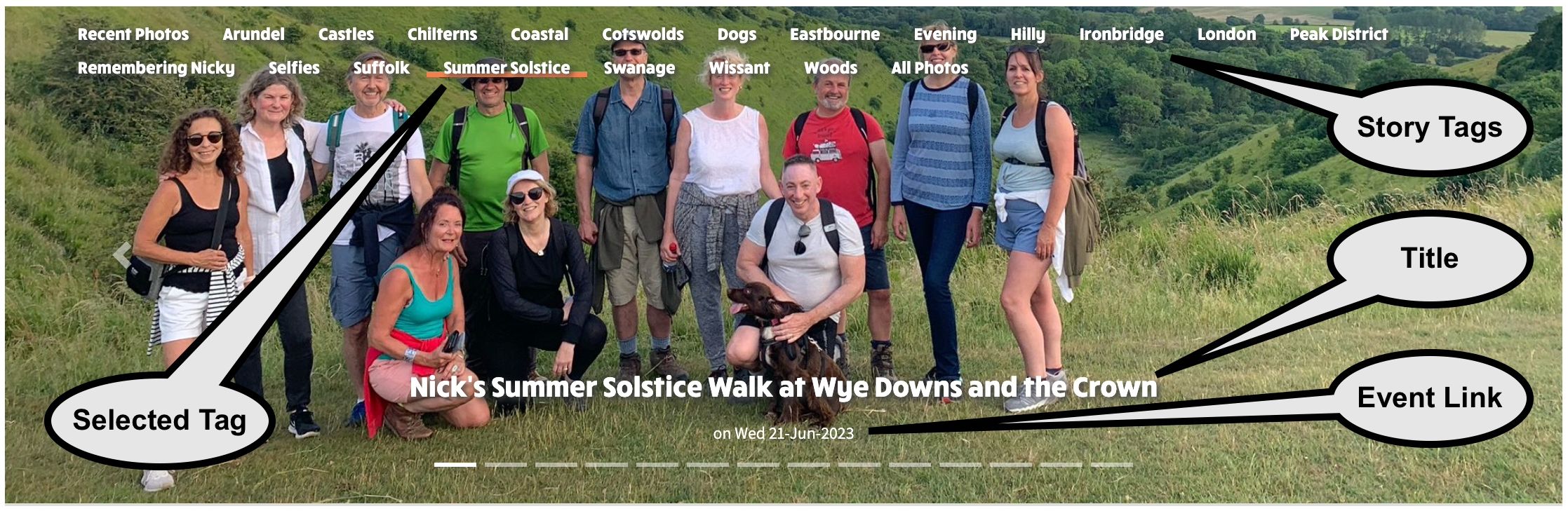
Carousel is one of the Album views available - the other two are Gallery and Grid. The Carousel is a good view to have for a home page given that image height can be limited as seen on the National Ramblers landing page banners. Other useful features built into Carousel view that make it good for your website home page view are that images can be organised into Stories, each image can be linked to a walk or social event and have a title added along the bottom. Below is an example screenshot of a Carousel with these features annotated:
Another advantage of the carousel is that recent images are selected by default based on the last 3 month's uploads, so the volume of images downloaded when you visit the page is limited. However it's no problem at all to have many hundreds of photos added to a single carousel's album, and to use Tagging to quickly switch the view between different sets of images. If you want to see a carousel with around 600 images working, have a look at this example.
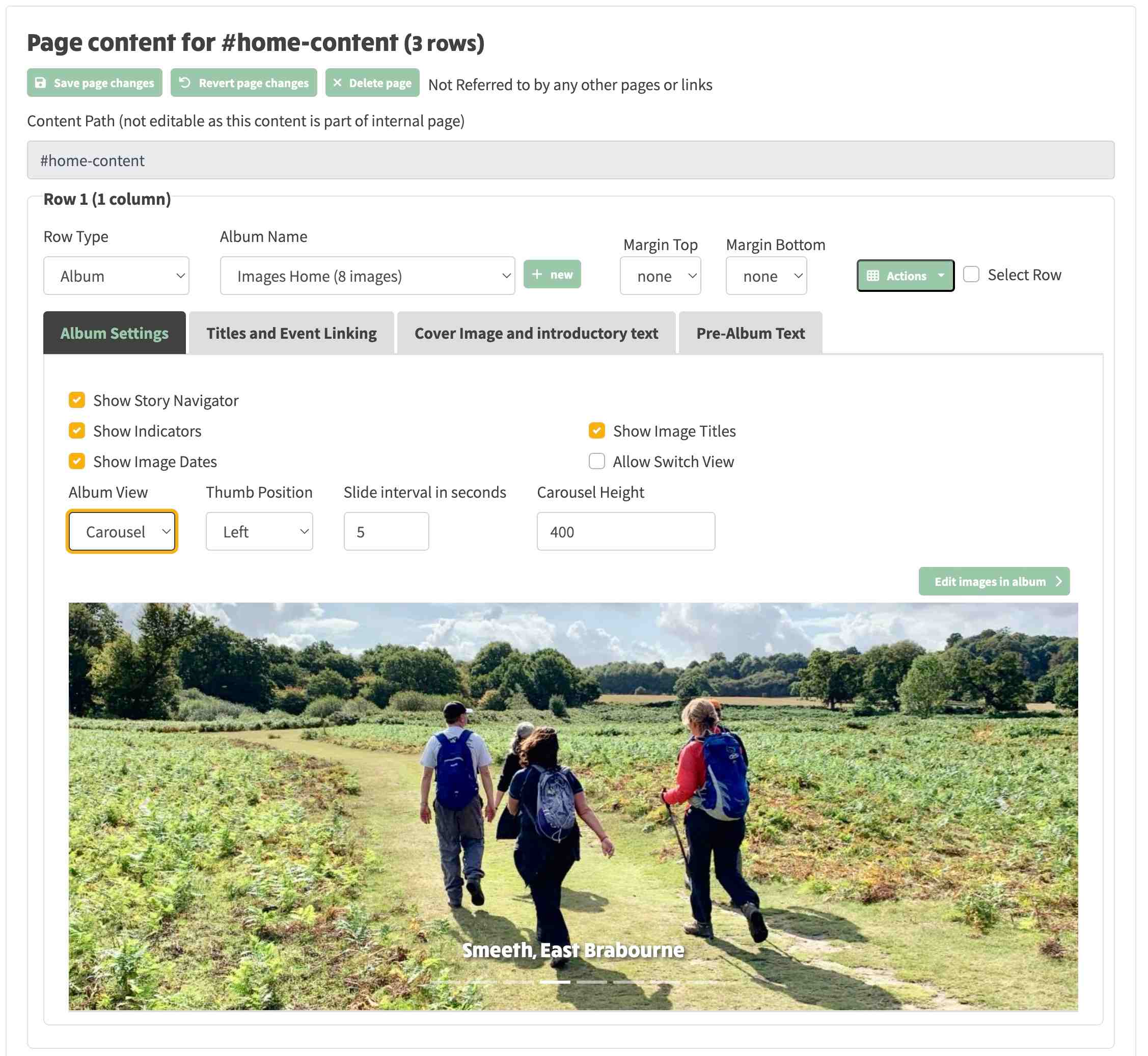
In the above screenshot, you can see the Row 1 Row Type is Album and in the Album Settings tab, the Album View is Carousel. There are a number of configuration options that affect the carousel as follows:
Show Story Navigator: checkbox to control whether the story links along the top are displayed.
Show Indicators: checkbox to control whether the pecked line is shown below the slide title (which can be clicked to go directly to an image).
Show Image Dates: does not apply to the carousel view - only affects grid view.
Show Image Title: does not apply to the carousel view - only affects grid view.
Allow Switch View: Allow the default view of carousel to be switched to Grid or Gallery by a toolbar that is displayed in the top right hand corner of the album row when the website is in presentation mode. Screenshot of this toolbar is shown to the right.