{"id":"69ef3c5ea82ec1b1033fb16c","title":"2026 04 27 Build 626","path":"how-to/committee/release-notes/2026-04-27-build-626","contentMarkdown":"# 27-Apr-2026 — cleaner Member Admin layout, shared contact dropdowns, and unified admin table styling... [#18](https://github.com/nbarrett/ngx-ramblers/issues/18)\n\n## [build 626](https://github.com/nbarrett/ngx-ramblers/actions/runs/24989456857) — [commit f8c4a2b](https://github.com/nbarrett/ngx-ramblers/commit/f8c4a2bd7257d3be2fbd879f6248348d9918710f)\n\n_____\n\n### Member Admin restyle\n- Replaced the heavy dark grey wrapper with a single clean white card\n(hairline border, modest padding) so the page sits flush with the rest\nof the admin area instead of looking like its own oddly-shaded box.\n- Merged the Email and Mobile columns into the Member Name and Mobile\ncells using a new shared dropdown. The name itself opens a Send email /\nShare / Copy email menu; the mobile number opens Call / SMS / WhatsApp\n/ Copy number. The Email column is gone, freeing screen real estate\nand making each row noticeably more compact.\n- Member Name no longer wraps; the cell expands to fit the full name.\n- Sticky horizontal scrolling now keeps both the Edit button and the\nMember Name visible as you scroll right, not just the Edit button.\n- Light alternating row stripes for easier scanning, applied to the\nsticky cells too so the stripe pattern stays consistent across the\nwhole row.\n- Last Bulk Load header markup brought back into line with the rest\n(it was a flex outlier in the markup). \n- See screenshot below for new look member admin screen:\n\n\n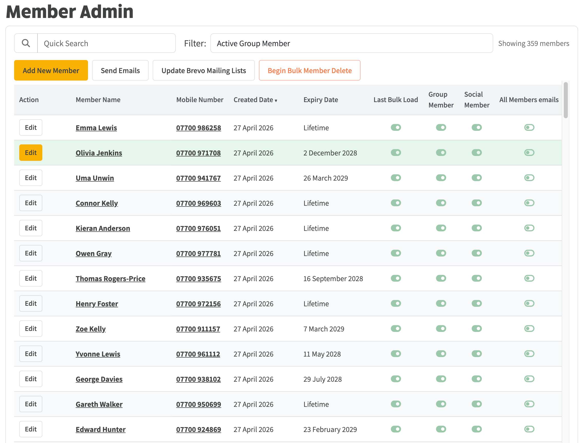\n\n\n### Shared admin table styling\n- Member Admin, Member Bulk Load, and any other admin table using the\nlegacy tbl-green-g class or Bootstrap's plain table class now share a\nsingle look: tokenised header background and text, alternating row\nstripes, and the same mintcake-tinted hover. Adding more admin tables\nin future picks up the styling for free.\n- New design tokens in tokens.sass for table header background and text\nand for the row stripe colour, used by both Member Admin and the Walk\nHistory audit so the two read as siblings.\n\n\n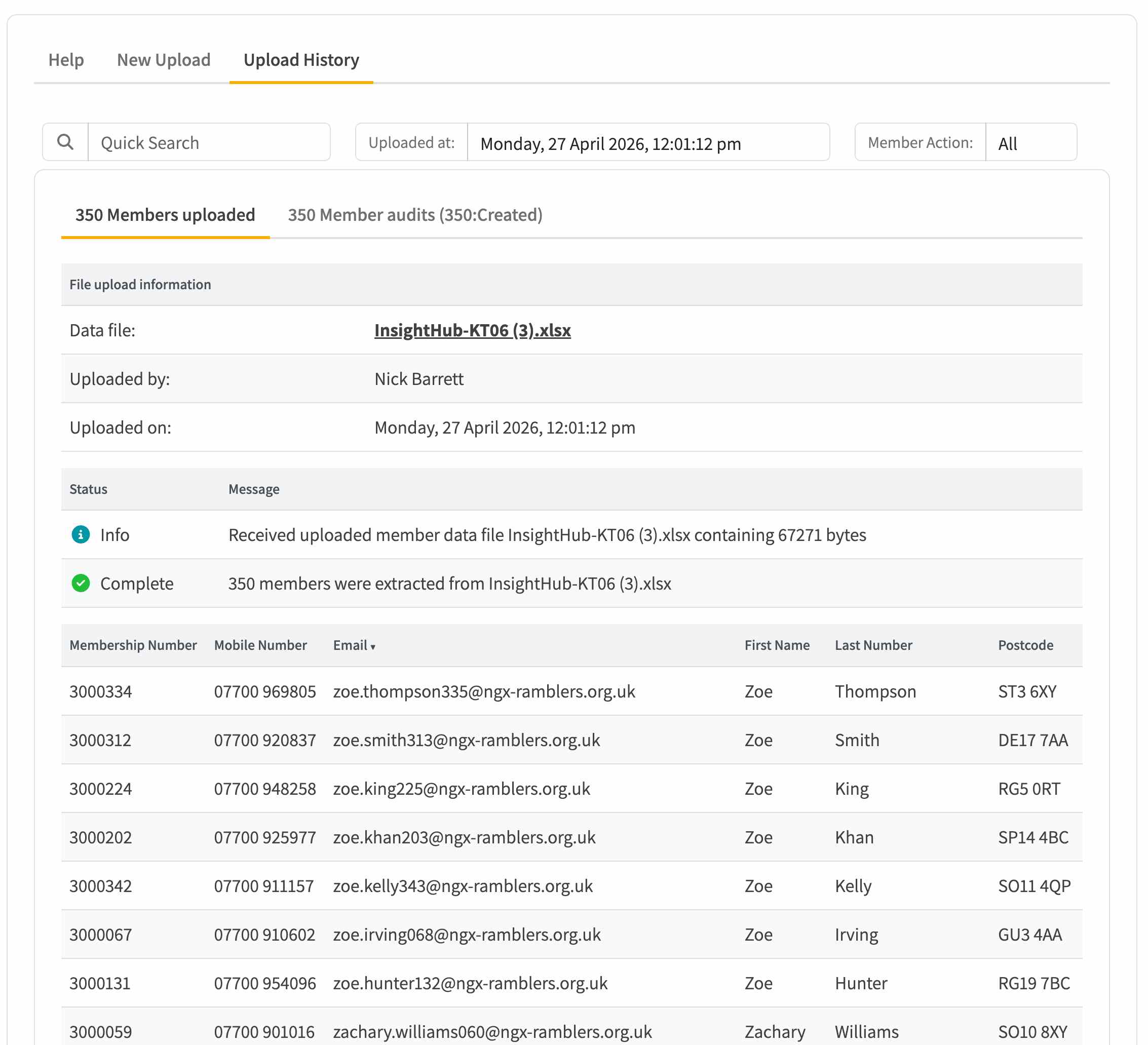\n\n\n### Walk Edit / tabs\n- Fixed a CSS shorthand bug in tabs.sass that was silently killing the\nmargin below the main tab strip (an invalid five-value margin was\nbeing dropped by the browser). Tab content now has proper breathing\nroom — the long-standing \"everything is too close to the tab\" feel\ngoes away once the rule actually applies.\n- Tightened the global thumbnail padding so framed sections don't\nswallow as much vertical space.\n\n### Walk history audit\n- Added the missing column header row (Date / Member / Event Type /\nNotes) so the audit list reads as a table.\n- Unified its column header colours and row stripes with the new shared\ntokens so it matches the Member Admin look exactly.\n\n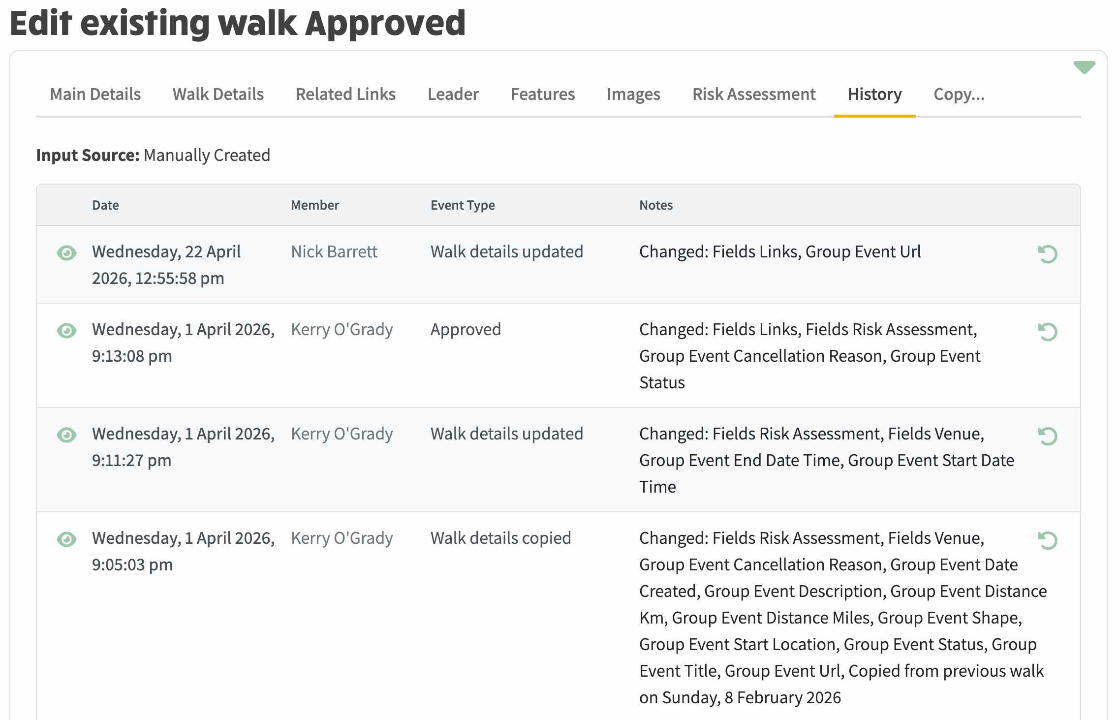\n\n\n\n### Shared scaffolding\n- New ContactActionDropdown component in modules/common. It takes a\ngeneric list of actions (label, icon, tooltip, href or onClick) and\nis the DRY home for both phone and email dropdowns going forward.\n- Both dropdowns now wait ~350ms on hover before opening, so the menu\ndoesn't pop while the cursor is just passing through.\n- WalkLeaderPhoneAction.COPY added so the walks-page leader phone\ndropdown also gains a Copy entry.\n\n### Markdown tables and mailman icon\n- Add a markdown table style block (markdown.sass) with light borders,\nrounded corners, header tint and alternating-row stripes so tables in\nCMS-rendered technical articles read as tables (rgba 0.10/0.14\nborders, mintcake hover at 0.16, 1rem font, 8px corner radius).\n- Add a new ngx:mailman envelope icon to the custom icon pack — filled\npaths only, so the polychrome rendering survives iconify processing\n(earlier rect/gradient versions rendered as faint gray). \n- Drives the visuals on the new [Mock to Production technical article](https://www.ngx-ramblers.org.uk/how-to/technical-articles/2026-04-27-salesforce-mock-to-production). Example of markdown table formatting is shown below:\n\n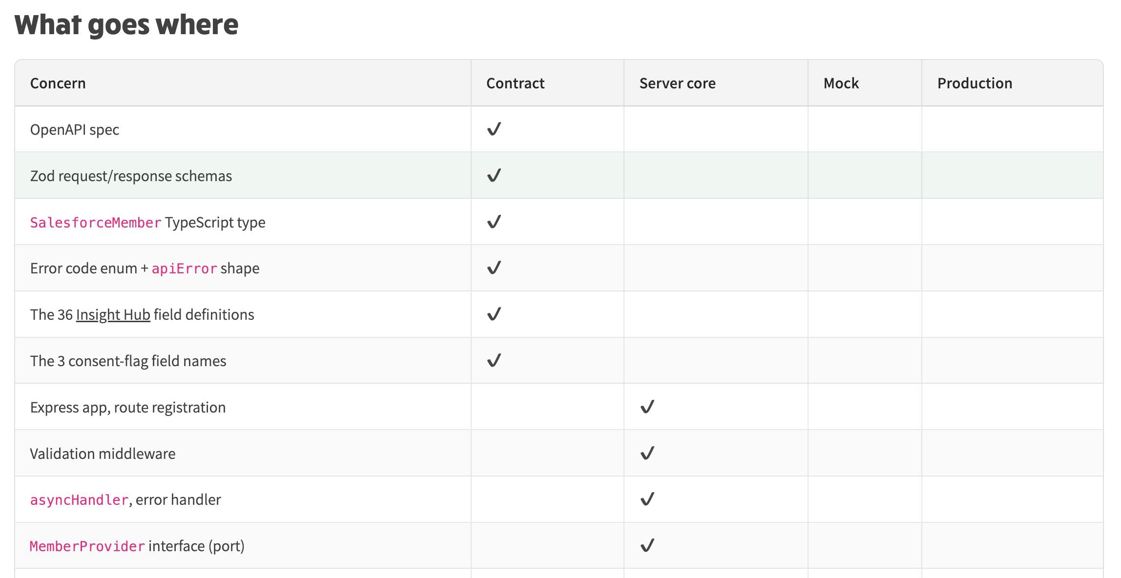","contentHtml":"27-Apr-2026 — cleaner Member Admin layout, shared contact dropdowns, and unified admin table styling... #18
\n\n
\nMember Admin restyle
\n\n- Replaced the heavy dark grey wrapper with a single clean white card\n(hairline border, modest padding) so the page sits flush with the rest\nof the admin area instead of looking like its own oddly-shaded box.
\n- Merged the Email and Mobile columns into the Member Name and Mobile\ncells using a new shared dropdown. The name itself opens a Send email /\nShare / Copy email menu; the mobile number opens Call / SMS / WhatsApp\n/ Copy number. The Email column is gone, freeing screen real estate\nand making each row noticeably more compact.
\n- Member Name no longer wraps; the cell expands to fit the full name.
\n- Sticky horizontal scrolling now keeps both the Edit button and the\nMember Name visible as you scroll right, not just the Edit button.
\n- Light alternating row stripes for easier scanning, applied to the\nsticky cells too so the stripe pattern stays consistent across the\nwhole row.
\n- Last Bulk Load header markup brought back into line with the rest\n(it was a flex outlier in the markup).
\n- See screenshot below for new look member admin screen:
\n
\n
\nShared admin table styling
\n\n- Member Admin, Member Bulk Load, and any other admin table using the\nlegacy tbl-green-g class or Bootstrap's plain table class now share a\nsingle look: tokenised header background and text, alternating row\nstripes, and the same mintcake-tinted hover. Adding more admin tables\nin future picks up the styling for free.
\n- New design tokens in tokens.sass for table header background and text\nand for the row stripe colour, used by both Member Admin and the Walk\nHistory audit so the two read as siblings.
\n
\n
\nWalk Edit / tabs
\n\n- Fixed a CSS shorthand bug in tabs.sass that was silently killing the\nmargin below the main tab strip (an invalid five-value margin was\nbeing dropped by the browser). Tab content now has proper breathing\nroom — the long-standing "everything is too close to the tab" feel\ngoes away once the rule actually applies.
\n- Tightened the global thumbnail padding so framed sections don't\nswallow as much vertical space.
\n
\nWalk history audit
\n\n- Added the missing column header row (Date / Member / Event Type /\nNotes) so the audit list reads as a table.
\n- Unified its column header colours and row stripes with the new shared\ntokens so it matches the Member Admin look exactly.
\n
\n
\nShared scaffolding
\n\n- New ContactActionDropdown component in modules/common. It takes a\ngeneric list of actions (label, icon, tooltip, href or onClick) and\nis the DRY home for both phone and email dropdowns going forward.
\n- Both dropdowns now wait ~350ms on hover before opening, so the menu\ndoesn't pop while the cursor is just passing through.
\n- WalkLeaderPhoneAction.COPY added so the walks-page leader phone\ndropdown also gains a Copy entry.
\n
\nMarkdown tables and mailman icon
\n\n- Add a markdown table style block (markdown.sass) with light borders,\nrounded corners, header tint and alternating-row stripes so tables in\nCMS-rendered technical articles read as tables (rgba 0.10/0.14\nborders, mintcake hover at 0.16, 1rem font, 8px corner radius).
\n- Add a new ngx:mailman envelope icon to the custom icon pack — filled\npaths only, so the polychrome rendering survives iconify processing\n(earlier rect/gradient versions rendered as faint gray).
\n- Drives the visuals on the new Mock to Production technical article. Example of markdown table formatting is shown below:
\n
\n
\n"}